I’m feeling much better now and I’ve pretty much finished reading my small haul of 3 comics from last week. I’m sure you’ve seen my review for Brightest Day #3, so all I’ve got left to review are the crimson DC duo of RED ROBIN #13 and RED HOOD: THE LOST DAYS #1. Check out what I thought of them under the cut.
What’s in a Cover Week 6: BATMAN #648
7 Jun
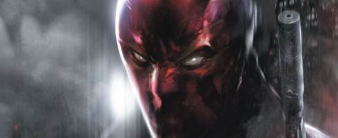
This week’s feature, which was also supposed to be last week’s feature, is BATMAN #648 which is the second Batman cover I’ve featured on this feature [that’s a lot of features]. This one, just like last week’s, is done by British comic book artist, Jock. Again, this cover showcases the same things we saw in last week’s feature: Iconic imagery, the use of a striking camera angle and an eye-catching strip of colors thanks to the negative space produced by the buildings.
Despite how tired and overused the image of Batman leaping through the rooftops of Gotham is, Jock makes it fresh by capturing Batman in mid-jump. In the cover, we barely get a glimpse of him but the silhouette produced is more than enough to make me thing ‘Batman’ without actually seeing him. It kind of reminds me of Paul Pope’s approach to the character in Batman: Year 100, where nobody, even the reader at times, really gets a good look at Batman – which really makes sense if you think about it. The lens flare is a nice touch as it accentuates, for me at least, the ‘street’ feel of the entire cover. I can almost see a snippet of this cover being taken and turned into a front page photograph for a Gotham tabloid – ‘BATMAN: THREAT OR MENACE’ [sorry, JJ]. This also makes me wonder why still haven’t seen a ‘MARVELS’ for the DC Universe, I’d love to see a tale like that.
Check out the entire cover behind the cut, folks.
Continue reading
DC/Marvel Logo Double Feature: Green Lantern/Thor
6 JunI’m still a little out of it, but I’m still more than capable of blogging about small bits and pieces of news that I find on the web.

Recently, unconfirmed, but still very convincing, photos of the movie logos for Green Lantern and Thor surfaced online. The Green Lantern logo came along with a poster featuring the tagline ‘Anyone Can Be Chosen.’ While the tagline might be slightly inaccurate – because technically not everyone can be a Green Lantern – it’s still an incredibly intelligent marketing ploy.
I can honestly see people [and kids!] eating that up and buying merchandise just to become ‘part of Corps.’ What are the chances we’ll be seeing novelty rings sold around toy stores around the time of the movie’s release? I know I’d like to get my hands on better versions of the Green Lantern power ring. Perhaps I could finally get a lightup one for a reasonable price point.
Tagline and marketing possibilities aside, the logo itself is a little underwhelming. I find that the imagery they used for the Lantern looks pretty weird. I get what they’re trying to do, making the flat lantern shape look a little more like a cross between the classic and the modern. But I don’t think the inner green ring really works. To me, it ends up looking more like a lime lifesaver than a power battery for the universe’s most powerful weapon. I’d much prefer it if they kept it simple and ditched the inner entirely or if they gave the image more depth much like the classic lantern.

Thor’s logo, on the other hand, is really simple and plain. However, I find it really interesting that they’re going for a more space-y feel than a Nordic one. If this is the real deal, what are the chances that this means that Thor isn’t a divine god and more of an advanced warrior race similar to Orion of the New Gods? If you were trying to ground things, I’d definitely say that advanced alien civilizations are much easier to swallow than full-on gods, so I really wouldn’t mind the change to the origin story. It would explain why Thor’s body armor looks a little more different and intricate than what you’d normally expect from a Norse god.
Interestingly enough, the movie logo they’re using doesn’t resemble the more traditional logo they unveiled a few years ago when they first showed their plan to do The Avengers in 2012. Perhaps this means we’ll be getting new logos for Captain America and The Avengers soon as they inch closer to their release dates.
If you’re hankering for better quality pictures, check out /Film for Green Lantern’s [they even have the poster with the tagline over here] and ComicBookMovie for Thor’s.
THE WEEKLY WEDNESDAY WRAP UP (06/02/10)
4 Jun
If you’ve seen my post detailing my dental woes [it’s directly below this post], I only have one review for the Wrap Up this week – BRIGHTEST DAY #3. The other two reviews will come some time next week. I have to say though, I find it interesting that Damian Wayne continued his streak of being awesome throughout his guest appearances in the Bat-Family titles in RED ROBIN #13.
Continue reading
I am a dentist!
4 Jun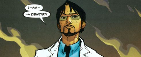
Well, not really.
I AM going to one tomorrow, though. And, judging by what my dentist told me, I might be completely out of it tomorrow after the entire procedure is done. What does that mean? No reviews tomorrow.
I might be able to get up a Brightest Day #3 review up later tonight if I have the time. But if I don’t, well – let’s just say that I didn’t enjoy it and I’m not bothering with it anymore after this one. Would anybody like to make suggestions for two other titles to fill in the void this series leaves?
Oh, and depending on how bad I feel tomorrow [by that, I mean if I’m totally out of it], the reviews for Red Hood: The Lost Days #1 and Red Robin #13 may or may not come sometime next week as a new edition of [really] Late Reviews. Apologies folks, I hope you bear with me.
The scan, which isn’t mine, is the unfortunately cancelled Blue Beetle series, specifically issue #16. Check it out folks, it’s really a great series – especially when Rogers completely took over the title.
Marvel Costume Double Feature: Thor/Captain America
3 Jun
I’m sure most of you have seen the pictures of the concept art for Captain America’s costume, but have you seen the unconfirmed but still very convincing pictures of Thor’s costume?
Well, if you said no to any of those – you’re in luck, because I’ve gathered both images under one post in an awesome COSTUME DOUBLE FEATURE. Check both of the images out behind the cut.
Continue reading
So, about that Green Lantern movie synopsis…
3 Jun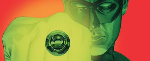
I might be pretty late with this, but man, the synopsis for 2011’s Green Lantern movie looks pretty awesome! It’s great when you see something awesome like Geoff John’s take on the Green Lantern mythos making the transition from comic book to the big screen.
I mean, seriously – check the synopsis out it just reeks of Johns:
“In a universe as vast as it is mysterious, a small but powerful force has existed for centuries. Protectors of peace and justice, they are called the Green Lantern Corps. A brotherhood of warriors sworn to keep intergalactic order, each Green Lantern wears a ring that grants him superpowers. But when a new enemy called Parallax threatens to destroy the balance of power in the Universe, their fate and the fate of Earth lie in the hands of their newest recruit, the first human ever selected: Hal Jordan.
Hal is a gifted and cocky test pilot, but the Green Lanterns have little respect for humans, who have never harnessed the infinite powers of the ring before. But Hal is clearly the missing piece to the puzzle, and along with his determination and willpower, he has one thing no member of the Corps has ever had: humanity. With the encouragement of fellow pilot and childhood sweetheart Carol Ferris (Blake Lively), if Hal can quickly master his new powers and find the courage to overcome his fears, he may prove to be not only the key to defeating Parallax…he will become the greatest Green Lantern of all. “
Now that isn’t all of the synopsis and if you want to see everything check it out over here from ComicBookMovie.com the site that confirmed the authenticity of the synopsis in the first place.
While the synopsis given seems a little different from what I expected it to be, I still think we’ll be seeing something pretty close to what we’ve got going on in Green Lantern proper right now.
Between this, Captain America and Thor, 2011 looks like a pretty awesome time to be a comic book fan, wouldn’t you say? I absolutely can’t wait to see some epic 3-D ring-slinging action and crazy CGI for Parallax [hopefully he doesn’t get Galactus’d] when this movie hits theaters next year.
THE WEEKLY THURSDAY[!] PREVIEW (6/03/10)
3 Jun
Yeah, since the comics are coming one day later than usual [Thursday for you guys, Friday for me], I decided to post the previews a day later than usual as well [blatant lies to excuse my lateness].
Actually, I was thinking of not even bothering with the previews considering that THIS is by far the smallest week I’ve ever had since I started collecting two years ago. With only one major release from DC, which I’m kinda iffy with, on my pull list this week, I might consider picking up a few other titles just so I have more things on my plate to read and perhaps even review.
Hit the jump button to see what I’m picking up this week and if you’re interested, why not drop me a comment and tell me what you’re picking up as well.
Continue reading
Mark Millar and Leinil Francis Yu’s SUPERIOR
2 Jun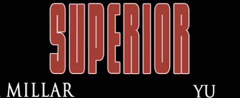
Love him or hate him, you have to admit that Mark Millar certainly knows how to catch attention. And he certainly has my attention with his new creator owned series with artist, Leinil Francis Yu – Superior.
While the teasers from ComicBookResources.com seem to harken to something a little less cynical or a little more ‘lighty brighty,’ if you will, the title of the comic certainly gives off an opposing feeling. I hope I’m wrong because I’d love to see Millar do some traditional, black-and-white super heroics for a change.
Also, I do have to say that it’s quite nice to see Leinil getting a really huge project to his name. While his Secret Invasion gig was pretty big, I’d say that actually owning a comic book with someone like Mark Millar is a bigger feat than that. Congratulations to him.
Anyway, this looks pretty interesting. Then again, Nemesis sounded pretty awesome on paper and fell pretty flat when it actually came out. Speaking of which, whatever happened to Nemesis? Has the second issue even come out yet? Either way, I’m hoping for the best for Superior – I’d love to see Millar in top form again.
Today, I Celebrate One Month of The Comics Blog!
1 Jun
Yes, it’s officially been over a month since I started The Comics Blog which is technically one week longer than I expected this thing to last. I’m glad I’ve stuck with this and I’m also glad that I’ve somehow [except for a two day hiccup] maintained the one-post-a-day promise I made to myself when I started. With June coming, you guys might see a decrease in the amount and frequency of posts, but rest assured – I’ll still pop in to preview and review comics on a weekly basis.
So, here’s to another month of posts and I hope you guys will stay tuned for more. Oh, and thanks for reading guys, I really appreciate it.
Comics I've Recently Reviewed
-

LATE REVIEWS FOR (06/02/10)
Red Robin #13, Red Hood: The Lost Days #1
-

THE WEEKLY WEDNESDAY WRAP UP (06/02/10)
Brightest Day #3
-

THE WEEKLY WEDNESDAY WRAP UP (5/26/10) – PART TWO
Fantastic Four #579 and Justice League: Generation Lost #2.
-

THE WEEKLY WEDNESDAY WRAP UP (5/26/10) – PART ONE
Batman: The Return of Bruce Wayne #2, Green Lantern #54 and Secret Avengers #1.
-

THE WEEKLY WEDNESDAY WRAP UP (5/19/20)
Avengers #1, Brightest Day #2 and Zatanna #1.
